The Coffee: A Clean Display Font for Digital Design
As a web designer who builds landing pages, SaaS dashboards, and boutique e-commerce sites, I choose fonts not just for looks—but for how they behave in real layouts. The Coffee is one of those rare display fonts that lands perfectly between personality and precision. It’s clean, all-round, and carries a subtle jolly spirit—never forced, never distracting. That balance makes it unusually effective across digital touchpoints where clarity and brand warmth must coexist.
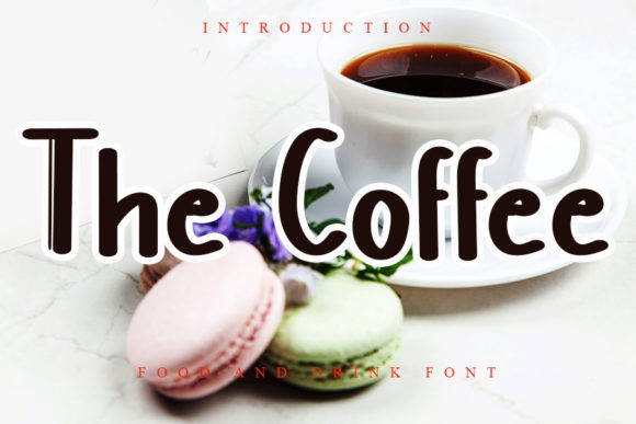
Visually, The Coffee features open letterforms, consistent stroke contrast, and generous x-heights—traits that support strong readability at larger sizes on screens. Its curves are friendly but controlled; its terminals are crisp without sharpness. Unlike many decorative display fonts, it avoids excessive flourishes or irregular spacing, which means it scales reliably from desktop hero headers down to mobile app banners. That predictability matters when you’re building responsive interfaces where every pixel serves a purpose.
Where The Coffee Earns Its Place in Your Layout
In practice, The Coffee excels where hierarchy meets humanity: hero section headlines, product name tags, course title cards, and CTA buttons with personality. It’s not built for long paragraphs or data tables—but it shines as the first thing users see. On a coaching website, it transforms “Your Journey Starts Here” into an inviting, grounded statement. In an online store banner, it gives handmade ceramics or sustainable apparel a warm, approachable voice—without sacrificing polish.
For portfolio sites or creative agency landing pages, The Coffee adds distinction without alienating. Try it for section headings like “Work,” “Process,” or “Let’s Connect”—paired with a neutral sans serif (like Inter, Manrope, or even system fonts) for body text. That contrast creates rhythm: The Coffee sets tone and intent; your body font delivers information. It also works well over subtle image overlays, especially with light text on muted backgrounds—its clean structure holds up where busier fonts would blur or compete.
Readability & Responsiveness: Practical Notes
On mobile, use The Coffee at 28px minimum for headlines—and always test line height. Its generous proportions mean it benefits from slightly more vertical space than condensed display fonts. Avoid using it below 24px, especially on buttons or small UI elements: legibility drops quickly when scale compresses its open forms. For dark mode interfaces, pair it with a high-contrast sans serif and ensure sufficient background opacity behind overlays—its warmth reads best against soft neutrals, not pure black.
If your project requires multilingual support, verify that the The Coffee package includes extended Latin characters. Most modern display fonts cover Western European languages, but check for accented characters used in Spanish, French, or Portuguese content—especially if your landing page targets global audiences or your SaaS tool supports international signups.
Smart Pairing for Digital Brand Consistency
Display fonts like The Coffee thrive in contrast. Pair it with a highly legible sans serif for UI labels, form fields, navigation, and paragraph copy. Think of The Coffee as your brand’s smile—and your body font as its steady voice. For editorial-style blogs or knowledge-based platforms, a restrained serif (such as Lora or Cormorant Garamond) can add sophistication beneath The Coffee’s playful headings—just keep serif weights light and line heights generous to avoid visual tension.
Avoid pairing The Coffee with other display or script fonts unless intentionally designing for high-impact, short-form graphics (e.g., social media carousels or email headers). In full-page layouts, competition between decorative elements dilutes focus—and weakens conversion paths. Simplicity here isn’t minimalism—it’s intentionality.
Licensing for Real-World Use
Before deploying The Coffee on a client site, live e-commerce store, or downloadable brand kit, confirm its commercial license covers web embedding. Most premium display fonts include WOFF2 files optimized for fast loading and support CSS @font-face declarations. Check whether the license permits use in SaaS applications, client-facing dashboards, or white-labeled templates—if you’re a UI designer selling Figma kits or Notion templates, this detail affects compliance and scalability.
Also review included styles: does The Coffee offer bold or italic variants? Some display fonts rely on a single weight, which limits typographic nuance. If your layout needs emphasis—like highlighting key benefit bullets or callouts—having at least one heavier weight expands flexibility without switching typefaces.
Ultimately, The Coffee stands out because it doesn’t try to be everything. It’s a focused tool: expressive enough for brand voice, disciplined enough for interface clarity. Whether you’re refining a Shopify theme, launching a micro-SaaS landing page, or refreshing a blog’s visual identity, it brings cohesion—not clutter. Its flexibility isn’t about endless variation, but about fitting naturally into the spaces where users pause, read, and decide.
That’s why, after testing dozens of display fonts for conversion-focused layouts, I keep returning to The Coffee. It doesn’t shout. It connects. And in digital design, that quiet confidence often converts better than noise.