Burgher: A Bold Display Font for Web Designers
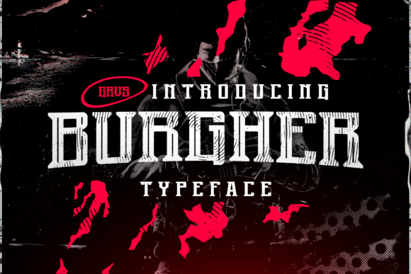
When you land on a website and something immediately grabs your attention before you even read a word, that is the work of a well-chosen display typeface. Burgher is exactly that kind of font. Thick lettered and vintage styled, this typeface has a presence that refuses to be ignored. For web designers, UI designers, and digital product creators, picking the right display font often means balancing personality with clarity. Burgher leans confidently into the bold side of that equation, bringing a rugged, old-school character that still feels fresh on modern screens.
What makes Burgher stand out from the dozens of display fonts released every month is its deliberate weight and nostalgic structure. The letters are thick, grounded, and unapologetically prominent. There is a vintage quality baked into the curves and terminals, reminiscent of old signage, classic poster design, and hand-painted storefronts. Yet the digital execution is clean. On a retina display or a high-resolution mobile screen, the edges stay crisp, and the letterforms hold their integrity. That balance between raw personality and digital polish is what makes Burgher a practical choice for real web projects, not just mood boards.
What Burgher Brings to a Digital Layout
Display fonts exist to command attention, and Burgher does that without feeling gimmicky. The thick strokes give it a sense of permanence and authority. When you set a headline in Burgher, it sits on the page like a statement piece. The vintage styling adds warmth and character, which can soften an otherwise sterile layout or reinforce a brand that leans into heritage, craftsmanship, or creative edge.
In terms of personality, this font communicates confidence, boldness, and a touch of nostalgia. It does not whisper. It does not try to blend in. For a digital product creator launching a new course, a boutique online store owner refreshing their seasonal banner, or a freelance designer building a portfolio, that kind of visual assertiveness is a valuable asset. You want the hero section to make a visitor pause and think, "This is different." Burgher delivers that reaction.
Where Burgher Performs Best in Web Design
Display fonts are not meant to do everything, and understanding where Burgher excels is key to using it effectively. This font is built for short, high-impact text. Think hero titles, section headings, call-to-action phrases, and brand taglines. It is not a body copy font, and it should not be forced into long paragraphs or dense blocks of text. But in the right spot, it transforms a layout.
Here are some practical applications where Burgher shines in digital design:
- Hero section headlines on landing pages, especially for creative brands, agencies, and product launches
- Call-to-action buttons with short phrases like "Join Now" or "Get Started"
- Online shop banners for seasonal sales, new collections, or featured products
- Portfolio site headers where you want your name or tagline to leave a mark
- Blog post titles in featured cards or hero graphics
- Course sales pages where the main headline needs to convey urgency and value
- Digital ad graphics for social media campaigns or email headers
- Logo text for brands that want a bold, vintage-inspired wordmark
- Brand kit headers and section dividers within digital brand assets
In each of these scenarios, Burgher acts as a visual anchor. It pulls the eye to the most important message on the screen and gives that message weight. For conversion-focused layouts, this is not just about aesthetics. It is about guiding user behavior. A strong headline in Burgher can increase the time a visitor spends on your hero section by several seconds, and those seconds matter when you are trying to communicate value and build trust.
Visual Hierarchy and Readability Considerations
Every web designer knows that visual hierarchy is the backbone of a usable interface. Users scan before they read, and they make split-second judgments about whether a page is worth their time. A display font like Burgher helps establish a clear top-level hierarchy. When the hero headline is set in a thick, vintage typeface and the body copy is in a clean, legible sans serif, the contrast creates an instant map for the eye.
However, bold display fonts come with readability trade-offs. Burgher's thick letterforms can feel heavy at smaller sizes. On mobile screens, where space is limited and text needs to breathe, it is wise to keep Burgher at larger headline sizes, typically above 24 pixels, and to limit its use to a few words at a time. For buttons, test the rendering on both iOS and Android devices. A short call-to-action like "Shop Now" or "Learn More" will read clearly, but longer phrases may feel cramped.
On dark backgrounds, Burgher's weight gives it a striking, almost luminous quality when set in white or a light cream. The contrast is dramatic and works beautifully for dark-mode-friendly designs or moody brand aesthetics. On light backgrounds, the vintage character feels more approachable and warm. When placing Burgher over an image, make sure the overlay area behind the text has enough contrast. A subtle dark overlay or a semi-transparent background strip can keep the letterforms legible without diluting the visual impact of the photograph.
Font Pairing Strategies for Digital Projects
No display font is an island, and Burgher reaches its full potential when paired thoughtfully with a supporting typeface. The general rule for web typography is to pair a decorative display font with a simple, highly readable body font. This creates a balanced system where the personality comes from the headings, and the clarity comes from the paragraph text.
For Burgher, a clean sans serif font is a natural partner. Think of geometric sans serifs with open apertures and neutral letterforms. The contrast between Burgher's vintage weight and the modern simplicity of a sans serif creates a tension that feels intentional and contemporary. This pairing works well for SaaS landing pages, creative agency sites, and online stores that want to feel both established and approachable.
If your brand leans more editorial or literary, pairing Burgher with a refined serif font for body copy can create a layered, magazine-like digital identity. The serif adds a sense of tradition and sophistication, while Burgher provides the bold, attention-grabbing headlines. This combination suits blogs, course platforms, and portfolio sites where long-form content and strong visual branding coexist.
Avoid pairing Burgher with another highly decorative display font. When two bold typefaces compete for attention, the layout becomes noisy, and the hierarchy collapses. Let Burgher be the star of the headline, and let the supporting font play a quiet, supportive role.
Mobile Responsive Layouts and Screen Testing
Responsive web design means testing how a display font behaves across different screen widths, device resolutions, and input methods. Burgher's thick letterforms are forgiving on large desktop screens, but on a 375-pixel-wide mobile viewport, a large headline can break awkwardly or push other elements out of alignment. Use CSS media queries to adjust font size, line height, and letter spacing as the viewport shrinks.
For mobile hero sections, consider reducing Burgher's size by 30 to 40 percent compared to the desktop version. You can also increase the line height slightly to give the letters more breathing room. On buttons, test tap targets carefully. A button set in Burgher should still have comfortable padding and a clear hit area. The font's weight helps with visibility, but the surrounding space ensures usability.
When embedding Burgher as a webfont, check the available file formats. WOFF and WOFF2 formats provide good compression and broad browser support. If variable font options are not available, make sure you have the specific weights you need. Loading unnecessary font weights can slow down page performance, and every kilobyte matters for Core Web Vitals and overall user experience.
Building a Consistent Brand Identity with Burgher
Consistency is one of the most underrated aspects of digital branding. When visitors move from your Instagram ad to your landing page to your checkout flow, the typography should feel like part of the same story. Burgher's distinct vintage character makes it a memorable anchor for a brand's visual identity. When you use it consistently across touchpoints, it becomes a recognizable signature.
For a creative portfolio, using Burgher for your name or tagline across every page creates a cohesive first impression. For a coaching website, the same headline font on the sales page, the thank-you page, and the email course graphics reinforces the brand's voice. For an online store, seasonal banners and product category headers in Burgher build a visual rhythm that returning customers will recognize and trust.
This consistency supports brand recall and professionalism. A visitor who sees a bold, vintage headline on your site and then encounters the same typographic style in your email newsletter experiences a seamless brand journey. That kind of cohesion builds trust faster than scattered, inconsistent design choices ever could.
Practical Licensing and File Format Considerations
Before integrating Burgher into a client project, online store, or digital template, take a close look at the commercial font licensing terms. Not all fonts are licensed the same way. Some allow unlimited web use on a single domain, while others require a separate license for each site, each page view threshold, or each digital product embedding.
If you are designing a website for a client, make sure the license covers commercial use and third-party deployment. If you are creating digital templates, social media graphics, or downloadable brand assets, check whether the license permits embedding and redistribution. For online stores with high traffic, page view limits on font licenses can become an issue if you do not plan ahead. Reading the terms upfront saves legal headaches and protects your work.
Also, check what is included in the font file package. Look for alternates, stylistic sets, and any additional weights. A font with alternate characters gives you more creative flexibility for logo design and custom headings. Multilingual support is another factor if your project serves a global audience. Accented characters, extended Latin sets, and punctuation marks are not always included in every display font, so verify this before committing to a design direction.
When Burgher Is the Right Choice
Choosing a display font is a decision about tone, usability, and brand alignment. Burgher is not a neutral, all-purpose typeface. It has a strong point of view, and that is precisely its value. When a project calls for a bold, vintage-inspired presence that still reads clearly on modern devices, this font steps up. It works for designers who want their headlines to feel substantial, their brand to feel confident, and their layouts to feel crafted rather than templated.
From a technical standpoint, it slots into a web typography system with minimal friction when paired thoughtfully, tested across devices, and licensed correctly. From a creative standpoint, it gives digital products a distinct voice that stands apart in a crowded landscape of soft, neutral sans serifs. Burgher is not for every project, but for the ones that need a bold, grounded, and character-rich display font, it is a powerful tool in the designer's toolkit.